
Project Context:
Like so many of us, my portfolio is inspired by events in my life. In this case - a terrible experience with an online restaurant menu. I had sat down at a trendy bar in 2022, scanned the QR code on the coaster and was appalled.
This project is based on a restaurant in central Boston that also began with a W (names have been changed to protect the uninitiated).
The problem:
The physical space was cool, the online QR code menu was not. For a site designed for phones it was glitchy, images and text clipped far off the left edge of smartphones, elements with horizontal scrolling, and more. It was a house of horrors for a designer.
The menu didn’t reflect the obvious care that went into making the restuarant, it's menu, or the food. It was clear there was a gap between their abilities towards physical and digital experiences.

So, I set myself the challenge of designing a mobile-first food/drink menu for them. I started making wireframes and redesigning the site as I sat there with my Negroni, sketching out how I wanted the overall menu to function to be easily scan-able.
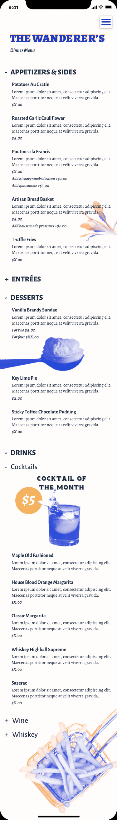
All the dishes are from the real menu.
I thought through how specific sections might be structured, in terms of information and typographical hierarchy, but also what controls might be used. And what users may have in mind as industry standard conventions for navigation (Doordash, etc).
Then I began thinking about other sections or services the restaurant might need to round out its website. Here are wireframes I began for an online ordering section of the site before I realized that for a small independent restaurant a purpose-built online ordering system likely wouldn't make sense or be a priority.

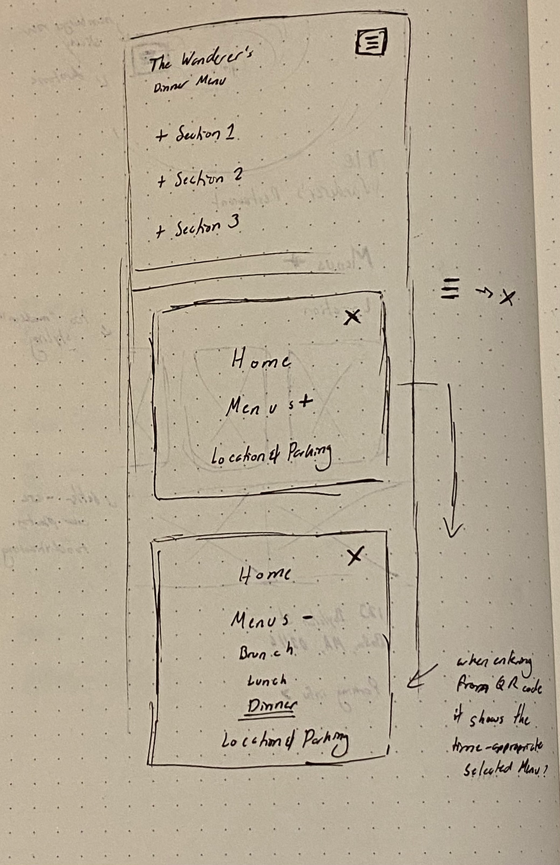
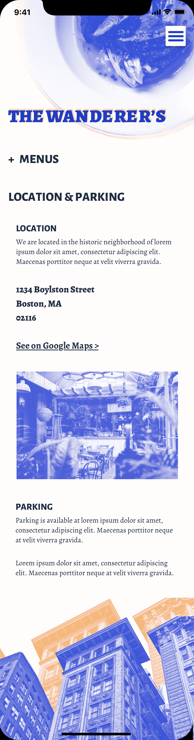
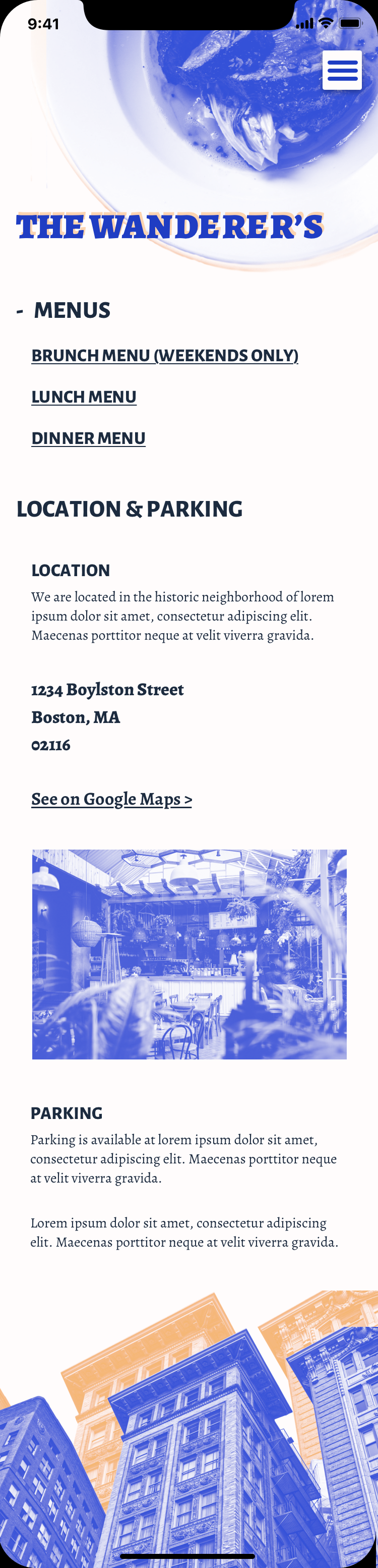
Next I pivoted to the design of the homepage. Beyond the QR code guests scan when they are in the restaurant this page has the biggest potential for use. Whether its a user finding the venue through a maps or city guide application or via search engine users will have questions and needs that can be easily solved by a streamlined homepage.
Location and parking information, and access to the menu without QR code being chief among them.
Below are the wireframes I created with these needs in mind.
I found this project a great exercise in thinking through a very logical exercise with a lot of common user pain points and a fun way to display my design process. After all, how many of us as design professionals have looked at something and thought;
"Please, I could do better than this!"

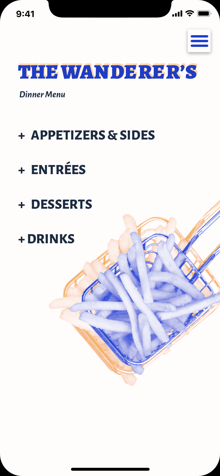
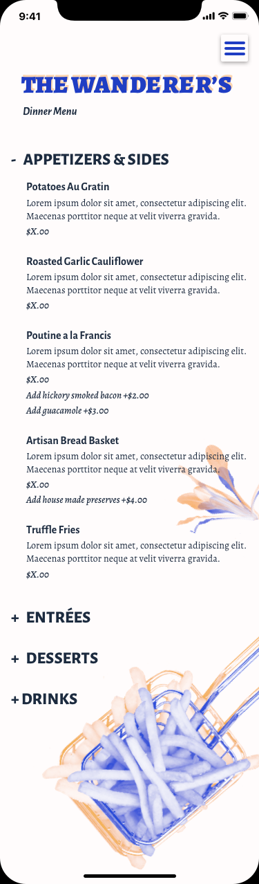


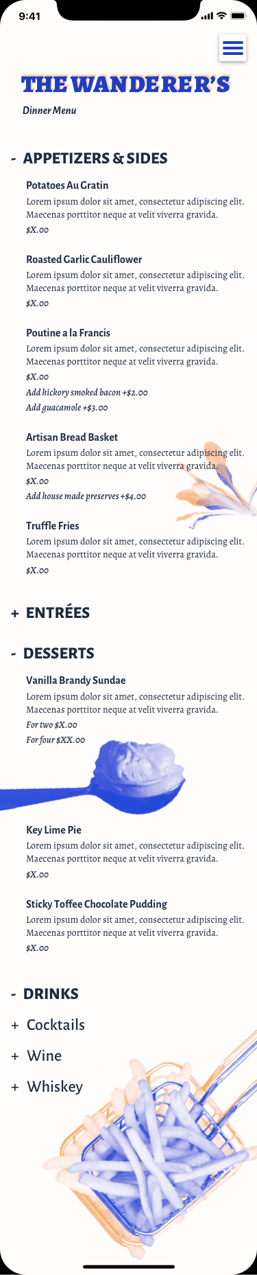

For the final screens I wanted to mirror the trendy, faux retro aesthetic of original restaurant with the poor digital menu (names will not be mentioned to protect the uninitiated). A complimentary color contrast and duotones felt very appropriate.
In many ways this reminded me of typography exercises back in design school and I enjoyed the challenge of making a menu with all its levels of complexity and hierarchy feel at home on a mobile phone screen.
Photography credits: Melissa Walker Horn - @ sugercoatit, Sharon McCutcheon - @ sharonmccutcheon, Skyla Design - @ skyladesign, Ruben Ramirez - @pinchebesu, Pascal Bernardon - @pbernardon, Edward Howell - @edwardhowellphotography
(All from unspash.com)