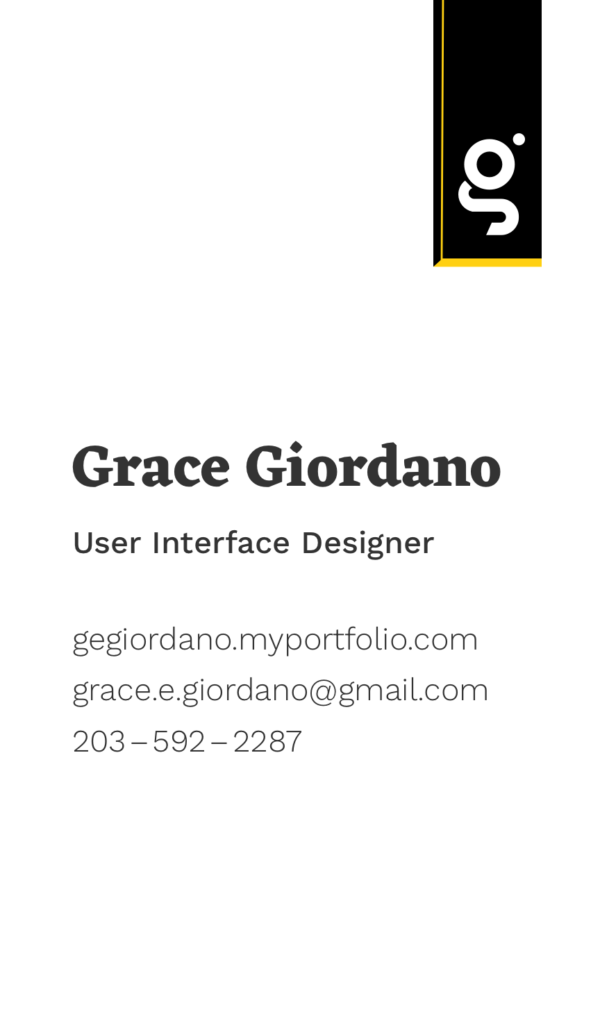


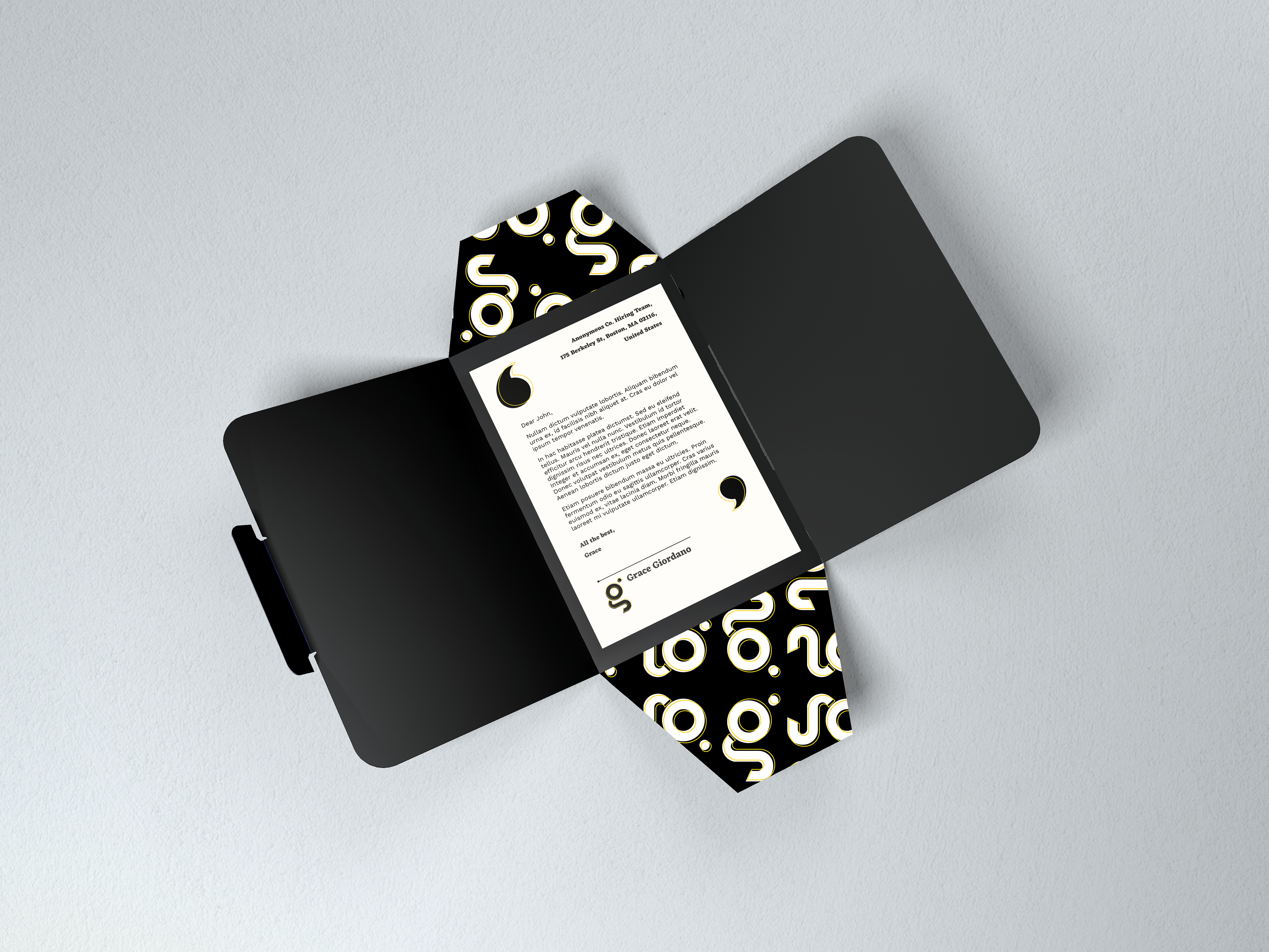
This system is designed to represent me in the professional world, and as such, I took a great time and care to develop them. All told the total process for the creation of these pieces took around ten months in my final months of design school and have seen updates as my brand and sense of self has continued to grow. These pieces have seen many ideas, iterations, and concepts come and go until I finally realized that it was far more important to let my accomplishments speak for themselves and try and create a simple, clean system with clear typographical hierarchy that would support and highlight my achievements rather than distract from them with pictures or graphics. I also spent far too long fussing over the spelling, line length, appropriate typeface (Eczar for my nameplate and section headings, and Work Sans for the body text) and em dashes, en spaces and other minute details. In short, I took the greatest care with this project as I knew it had to represent the care I take in all my work and stand up under the intense scrutiny of the job market.
I also made the conscious choice to move away from my previous typeface choices Adobe Caslon and Brandon Grotesque to web-safe typefaces as I keep telling myself one day I'll code my own portfolio website. But, to quote a friend and software engineer for a prominent Boston tech company: "I've never written a functioning piece of code and I don't intend to start now!"
In 2020 I also updated my logo, simplifying it and bringing it in line with my current aesthetic sensibilities.